Tuesday, March 20, 2012

Duncan on black paper phase 2


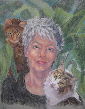
I put more lights on the left background and added some orange to tie in with the subject. This is also taken in cool light and not as bright as the real painting.

You can see where I taped it off to cover it in ink. After almost dry, I weighed it down to make it flat again.

I will blend the background more and add whiskers.

Duncan on white paper phase 2


I worked on this one today and like it a lot better. I'm not sure I'm finished.

This is taken when sky is overcast, and I will try another photo with the sun out. The oranges look dull here.

I'll have another go at it.

Duncan on black paper phase 1


This is the same image of Duncan done on Rives BFK
paper that I covered with India Ink and a brush. The shadows are still too dark...the contrast in values is too great.

But, this one looks more like my dog than the other, so I am partial to it.

This one has 3 layers: pan pastels and then sticks. There is no white or black used, which is alittle hard to see on this photo.

Duncan on white paper phase 1


This is as far as I got on a demo for CTPA last week-end in Georgetown. I am using pan pastels on Rives BFK printmaking paper. I told everyone that you can get about 3 layers on the paper, but as I've been working on it today, I've gotten more than I thought.

I started with a light touch with pan pastel applied with cotton balls and q-tips. The next layer was with sticks of pastel.

My next blog entry shows more.