Saturday, September 1, 2012

Sunday, July 22, 2012
Magnolia 3

I may go in and work on the long green leaves in the forefront, but I am about done with this.
Friday, June 22, 2012
Magnolia II

Morning Glory mug

Saturday, June 16, 2012
Spodumene glazed casserole

Trumpet vine cup

Thursday, June 7, 2012
Carved Cup cobalt blue

This is the first cup that has turned out the way I wanted. There is a triple layer of porcelain slips that I carved through. Glaze ^10 over white stoneware.
Saturday, June 2, 2012
Squirrel Urn

Carved stoneware, white and black slips, clear glaze, cone 10

Magnolia 2

I also find the upper left corner too distracting. So I have another session to do.
Thursday, May 31, 2012
Magnolia 1

It looked so much brighter in my studio, so I need to go back in and work on it. It's still pretty dark, which is good as the lighter colors are easier to put in at the end. I have noticed that there is no removing the pastel once it in on the surface, and no blending with my finger. So I have used only soft pastel on it's side. It is very interesting and new.
Sunday, May 20, 2012

Sunday, May 6, 2012
cat cup

Friday, May 4, 2012


Friday, April 27, 2012

Monday, April 9, 2012
Celedon bowl

I enjoyed doing the carving on the leather hard clay to get the design on this 8" bowl.
The Celedon green glaze is not as vibrant as I wanted, probably because my clay isn't porcelain.
I have never been able to throw with porcelain, but got some porcelain "like" clay to try next time I want to get a richer green.
white thrown clay, carved decoration, celedon glaze cone 10
copper red tea cups with lids

The lids keep the tea hot while steeping, and then they turn over to receive the tea bag.
Red is a very hard color to get, and hard to control. You can see where the kiln didn't reduce enough on one side of the cups to turn it to red. But, I kind of like the combination. The red is so nice on the side that the white just sets it off.
Wheel thrown cone 10 white clay, copper red glaze.
6 inch bowl
 I really like this combination of glazes. I love the throwing process and find glazing to be very challenging. This one worked, but I have several really bad ones.
Thrown white cone 10 clay with black glaze and over-dip of rutile glaze, red iron stamp decoration.
Tuesday, March 20, 2012
Duncan on black paper phase 2

I put more lights on the left background and added some orange to tie in with the subject. This is also taken in cool light and not as bright as the real painting.
You can see where I taped it off to cover it in ink. After almost dry, I weighed it down to make it flat again.
I will blend the background more and add whiskers.
Duncan on white paper phase 2

I worked on this one today and like it a lot better. I'm not sure I'm finished.
This is taken when sky is overcast, and I will try another photo with the sun out. The oranges look dull here.
I'll have another go at it.
Duncan on black paper phase 1

This is the same image of Duncan done on Rives BFK
paper that I covered with India Ink and a brush. The shadows are still too dark...the contrast in values is too great.
But, this one looks more like my dog than the other, so I am partial to it.
This one has 3 layers: pan pastels and then sticks. There is no white or black used, which is alittle hard to see on this photo.
Duncan on white paper phase 1

This is as far as I got on a demo for CTPA last week-end in Georgetown. I am using pan pastels on Rives BFK printmaking paper. I told everyone that you can get about 3 layers on the paper, but as I've been working on it today, I've gotten more than I thought.
I started with a light touch with pan pastel applied with cotton balls and q-tips. The next layer was with sticks of pastel.
My next blog entry shows more.
Saturday, February 25, 2012
Finished Tiger
This has the whiskers finished . Here's today tip on these delicate aspects of an animal. I don't use white. The ones on the left are light blue, and the ones in the shadow right side are light purple.
I put in a dark violet line right under the light whisker to make the line stand out. I use value contrast instead of white because I think white tends to flatten and is less interesting. Especially if you use too much of it There is no white in this painting.
I am pleased with this and am so glad I was asked to do it. I've wanted to do this tiger for some time but was stuck. Now I'm ready to paint more.
 . Here's today tip on these delicate aspects of an animal. I don't use white. The ones on the left are light blue, and the ones in the shadow right side are light purple.
I put in a dark violet line right under the light whisker to make the line stand out. I use value contrast instead of white because I think white tends to flatten and is less interesting. Especially if you use too much of it There is no white in this painting.
I am pleased with this and am so glad I was asked to do it. I've wanted to do this tiger for some time but was stuck. Now I'm ready to paint more.
Friday, February 24, 2012
Almost finished

I word on him awhile yesterday and got in more vegetation and cleaner features. The nose is greyed down and darker in value. The eyes sit back nicely. The reflection is sharper in the left eye as I wanted for variation and to keep the head rounded.
Now I think I am ready to put in the whiskers. It is the last thing and fun to pencil in with pastel pencils. I may put alittle more green in the background too.
Demo for Art Guild
 This was as far as I got for my demo this last week. I got in the basic design and the temperature I wanted. The eyes look "buggy" to me and when I stood back, the nose was way too light and too pink. It is a nose for a house cat.
I do like the pink, blue and yellows instead of white. I will take it home and finish it.
Sunday, February 19, 2012
Bee Pot

Here is the new lidded container I finished last week. I like the color and how the bees turned out. I have 2 cups in the glaze kiln with the bees. I hope one will match.
Saturday, February 18, 2012
Oregon landscape

Another try at a path into the woods. I would like to change the width of the strokes on the road. The back in thinner strokes and wider on the bottom.
Not really satisfied with one. I'll do this again sometime
Sunday, February 12, 2012
landscape from Oregon

This is a small one, but I am pleased with the colors. The atmosphere there was very clear and the greens had alot of blue... not like our warm sage greens here in Texas.
Thursday, February 9, 2012


Tuesday, January 3, 2012
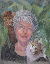
Terry's Girls

This is from photos taken this summer in Oregon, where we visited Janet and Terry with their two grey kitties, Bruzer and Bella. This is Bella, the lovely.
Subscribe to:
Posts (Atom)